Ready to Play: What are the Best Designed Bingo Sites in the UK?
When designing a bingo website for mainstream use, it may be tempting to sideline style and aesthetics in order to guarantee a seamless consumer experience. The primary goal of any gaming website is to drive transactions and optimise sales conversions, ensuring that players are able to easily make deposits and quickly access games.
It is unwise to discard the design elements of a website completely, however, as small details can make a considerable difference in such a crowded and competitive marketplace. By distinguishing a website with advanced graphics and a colourful design, it is possible to afford it a critical edge and appeal to a wider demographic of players. After all, we’re going to play at the prettiest and easy-to-use site aren’t we?
With this in mind, the team at Bingo Sites have created a shortlist of the three websites with the most alluring and eye-catching design…
Vampire Bingo
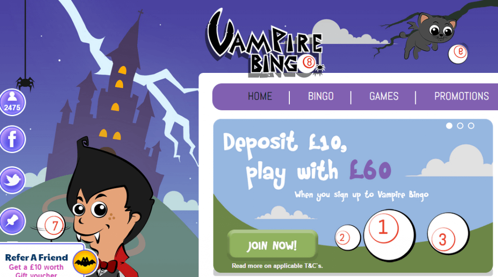
Top marks should be awarded to the team behind the Vampire Bingo website, which has a dedicated theme, an engaging colour palette and considerable technology behind it. While it may have a relatively restricted selection of 35 games available for players, its striking contrast of pink background and purple icons instantly catches your eye and provides the ideal backdrop for the brand’s interactive mascot. For new players who are orientated by their instinct, this is an extremely popular bingo website.
Bingo Crazy
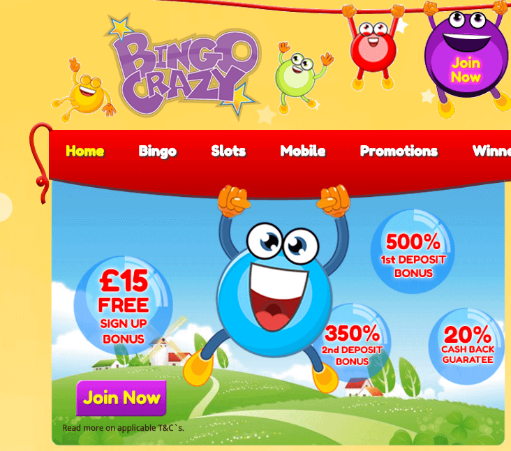
As the name suggests, Bingo Crazy is a fun and interactive gaming whirlwind that engulfs even the most experienced of players. It is also as colourful and vivid as you may expect, combining sky blue and orange with bold reds and evocative shades of green. The range of graphic characters and icons are also relatively advanced, creating a visual experience that is rewarding and unique. So although the name may hint at chaos rather than design, it is clear that a great deal of thought has been invested into the creation of this particular bingo website.
Gone Bingo
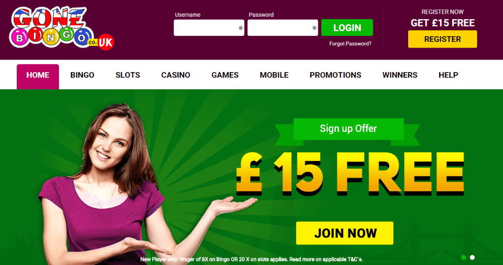
If there is one word that can be used to describe the Gone Bingo website, it is colourful. Utilising a combination of pastel and old shades, it is visually compelling and offers something to players who are willing to look beyond the fundamental elements of finance, gameplay, and promotional offers. The developers have also invested in a busy and hectic design, which may not be to everyone’s tastes but does manage to convey excellent graphics and a genuinely positive energy. It is certainly unique from a visual design perspective, and this affords it a competitive edge in a market that is becoming increasingly well-populated with bingo resources.
Last updated: Jan 24, 2023

